Charts
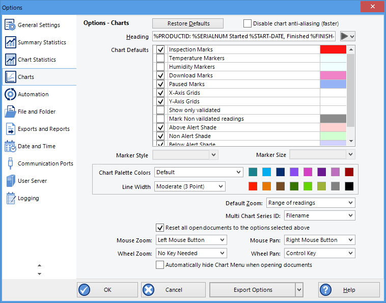
In the Chart Options window you can influence how charts are being displayed in the chart tab.

Chart options
Restore defaults
Clicking this will re-set all controls and values on this window to the default settings.
Heading
You can combine a number of different variables and your own text to create a chart title. The controls work the same as described in the section about the File Name.
Chart defaults
The various settings can be enabled or disabled by clicking the check box for the relevant item in the list. If ticked, an item is enabled.
When you highlight an item, relevant controls below the list will become active.
You can click on the colour selection box to change the colour.
Some items cannot have their colour set, for example the axes. In this case the colour selection box will not appear.
Markers:
Aside from turning markers on and off you can select colour, style and size.
Shaded areas
You can set the chart background so different colours are used for the regions "at or above high alert limit", "between high alert limit and low alert limit" and "at or below low alert limit". This allows out-of-range and in-range data to be recognised easily on the listed or charted data.
Select the shading for each area independently, and select a colour.
By default these settings are enabled, with red for "above alert", blue for "below alert range" and green for the non-alert range.
By selecting a line style for the "above high alert limit" and "below low alert limit" regions you can improve the readability of the charts on black and white printouts.
Gridlines
Enabling the grid lines displays vertical (x-axis) or horizontal (y-axis) lines which help you identify readings relative to each other. By default both grids are enabled.
Non-validated readings
You can choose to include or exclude non-validated data from the chart display by clearing or selecting the "Show only validated" check box. If non-validated data is to be displayed, it can either appear just like validated data, or you can define a different colour and marker style to be used. Select "Mark non-validated readings" to display non-validated data in the selected colour/style.
Readings beyond specifications
Sometimes the (missing or bad snippet) can record readings beyond the specified measurement range. In this case
- the Chart and report tabs will not show the out of range values and the chart curve will appear with broken lines
- the Data tab will include "<" or ">" for each reading that is beyond the specification range
- the Statistics display will include "**" for each statistic that includes readings that are beyond the specification range.
If the option "Show readings beyond specification" is enabled, all recorded reading values will be displayed, even if they are beyond the operating range of the (missing or bad snippet).
For example, the TRIX-8 has a published minimum temperature of -40°C. Temperatures down to -41.5°C may be displayed if the Show readings beyond specification is enabled, however the accuracy of recordings between -40°C and -41.5°C is unknown. -41.5°C will be displayed even if the temperature falls to a much lower actual value.
(missing or bad snippet) provides no guarantee of temperature reading reliability or accuracy beyond the published range for any product; enabling this option for general use is not recommended.
Chart Palette Colours
Select the colours for the chart lines. In single charts the first colour is used for temperature, the second for humidity.
In Multicharts the colours are used in the order the charts are opened. The same colours are also used when the Multichart is switched to display average/min/max.
When you choose custom you can set your own colours.
Some experimentation with these settings will show very quickly how they work. Select a colour in the colour panel, click and go to the Data screen to see the resulting change.
Default Zoom
You can define the minimum and maximum y-axis values initially displayed when opening the chart.
- Range of readings: this scales the chart so the maximum and minimum temperature displayed is just above/below the highest/lowest temperature reading recorded by the (missing or bad snippet). If you choose this option the maximum screen area is used to display all recorded readings.
-
Range of sensor: this scales the chart to show the full temperature measurement range of the logger.
-

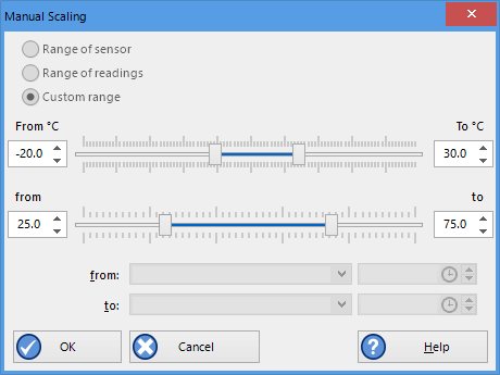
Custom range selection window
Custom range: When you select this option, an additional dialogue appears. Here you can enter two temperature values and two humidity values, which are used as maximum and minimum values for the chart's y-axis, regardless of the value of the recorded readings.
These settings are stored when the software is closed.
Regardless of these settings, you can always zoom in or out using the various zoom settings (see Zoom Control on page 1). When using the context menu in the chart tab you can also temporarily override the manual settings with new ones.
Multichart Series ID
Here you select which property of the file is listed in the legend for a Multichart next to the colour code for the chart. You can choose from the following pre-selected combinations of properties:
- Filename
- Model and Serial Number
- Model and Description
- Serial Number and Description
- Model, Serial Number and Trip number
- Model, Description and Trip number or
- Serial Number, Description and Trip number
Auto-hide Chart Menu
If you wish to see more of a chart when it is first opened, you can select this feature. The Chart Control Panel will then be minimised when a chart tab is first opened. If selected, you need to click the toggle button in the lower right corner of the screen to view the chart panel.
Disable chart anti-aliasing
Selecting this option will enable charts to draw faster on the screen, however they will not look as smooth and have more ragged edges.

Anti-Aliasing turned on

Anti Aliasing turned off
Reset all open documents
When selected the options as entered will be applied to all open documents when the clicking on ![]() .
.
Zoom and Pan Controls
These settings control how you pan and zoom using the mouse's wheel and buttons. You cannot use the same control for different actions, i.e. you cannot use mouse zoom and mouse pan with the same button.
Mouse Zoom
By default you zoom in by dragging a rectangle on the chart while holding down the left mouse button. You can change this to the right or middle button, or disable the function.
Mouse Pan
By default you pan by holding down the right mouse button and dragging the chart. You can change this to the left or middle button, or disable the function.
Wheel Zoom
By default you can use the mouse wheel to zoom in and out without holding a key on the leyboard. You can change this so you need to hold the CTRL key or the SHIFT key while rotating the wheel, or you can disable the function.
Wheel Pan.
By default you can use the mouse wheel to pan left and right (when the chart is already zoomed in) by holding the CTRL key while rotating the wheel.
in and out without holding a key on the keyboard. You can change this so you need to hold the SHIFT key while rotating the wheel, requiring no key, or you can disable the function.